One of the strategies of global-warming
deniers has been to control the debate. A few years ago, every
conservative talk show would spend part of their time listing places
that had record low temperatures, as if they could understand
global-warming one bit at a time. Climate scientists have not been so
good at framing their own arguments.
For example, in the minority report to
the Senate Environment and Public Works Committee, it is stated that
there has been a 15-year hiatus in global warming. The report draws
the only conclusion it wants people to hear: The threat of global
warming is over and we can all breathe easier now. The deniers are
not concerned about scientific proof. They are only concerned about
influencing voters to protect the big energy producers. Exxon-Mobil
earned 15 billion dollars before taxes last year. They can easily
afford to spend a couple of hundred million to keep their gravy train
moving on down the track.
If you present this finding to a
scientist, the first question that comes to mind is, where did all
that energy go? We know from scientific measurements that the
concentration of CO2 in the atmosphere is increasing at an
accelerating rate. This fact is shown graphically in the chart below:

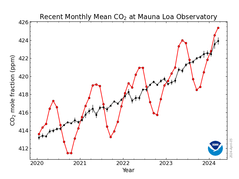
This chart shows the annual increase in
CO2 in the atmosphere at Mauna Loa in Hawaii. The black lines show
the average increase of CO2 over a five years. The rising black line means that the rate of increase is accelerating to the present year.
These figures show that CO2
concentration was increasing at an accelerating rate. But world
temperatures apparently did not increase at an accelerating rate. The
amount of energy absorbed by the planet from the sun increased. That
energy had to go somewhere. The following chart shows that vast
amounts of energy have been absorbed by the earth's oceans:
 |
| Chart provided by NOAA |
Notice that the temperatures of the
land, ice, and atmosphere have not increased greatly in comparison
with the temperatures of the ocean. The ocean has been acting as a
huge heat sink, absorbing by far the greater portion of increased
solar radiation due to increased concentration of CO2 in the
atmosphere. The problem for mankind is that the ocean does not retain
its heat forever. It is continually releasing its heat into the
atmosphere, and the atmosphere has been rapidly increasing in
temperature since 1970.
Even if the temperatures were receding,
as proclaimed by the deniers, the energy is still building up in the
oceans. This energy will affect the climate of the planet for
hundreds of years and more. The daunting task ahead of us is to
reverse the absorption of energy by reducing the amount of CO2 and
other greenhouse gases we release into the atmosphere. Other effects
of global warming so dear to the deniers, such as melting ice-caps,
more violent storms, and flooding, are only by-products of the vast
amounts of energy we are storing up on our planet.
The deniers don't want to discuss abstractions like energy, which are difficult to deny. They prefer to discuss CO2, which is invisible, and temperatures at particular locations, which everyone understands. Scientists have a different perspective on the planet, however. They have been having difficulty convincing the rest of us about the dangers we face from global warming.
The scientists have been having no difficulty whatever convincing each other. So few papers have been written by deniers that it's hard to display them graphically. The last chart is an attempt to do just that:
 |
| Chart provided by James Russell Powell and DeSmogBlog |
No comments:
Post a Comment